Website redesign elements for a Kansas City non-profit
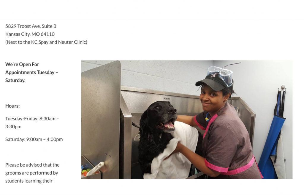
The original price list for grooming services made it difficult to find the information that was needed.
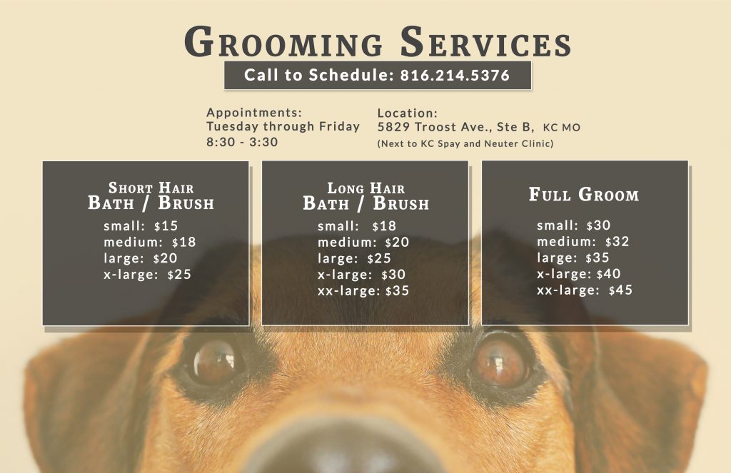
I made happy, colorful lists with services organized by need, making it easy to find what the customer is looking for.

The original home page slider was challenging to read and the real message wasn't completely conveyed.

A picture of a student and her child, along with a few words, captured the intent of the original homepage slider.
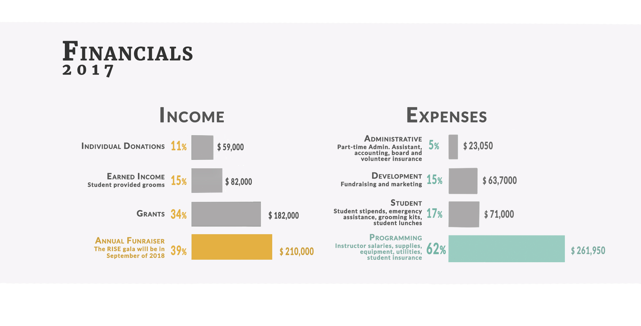
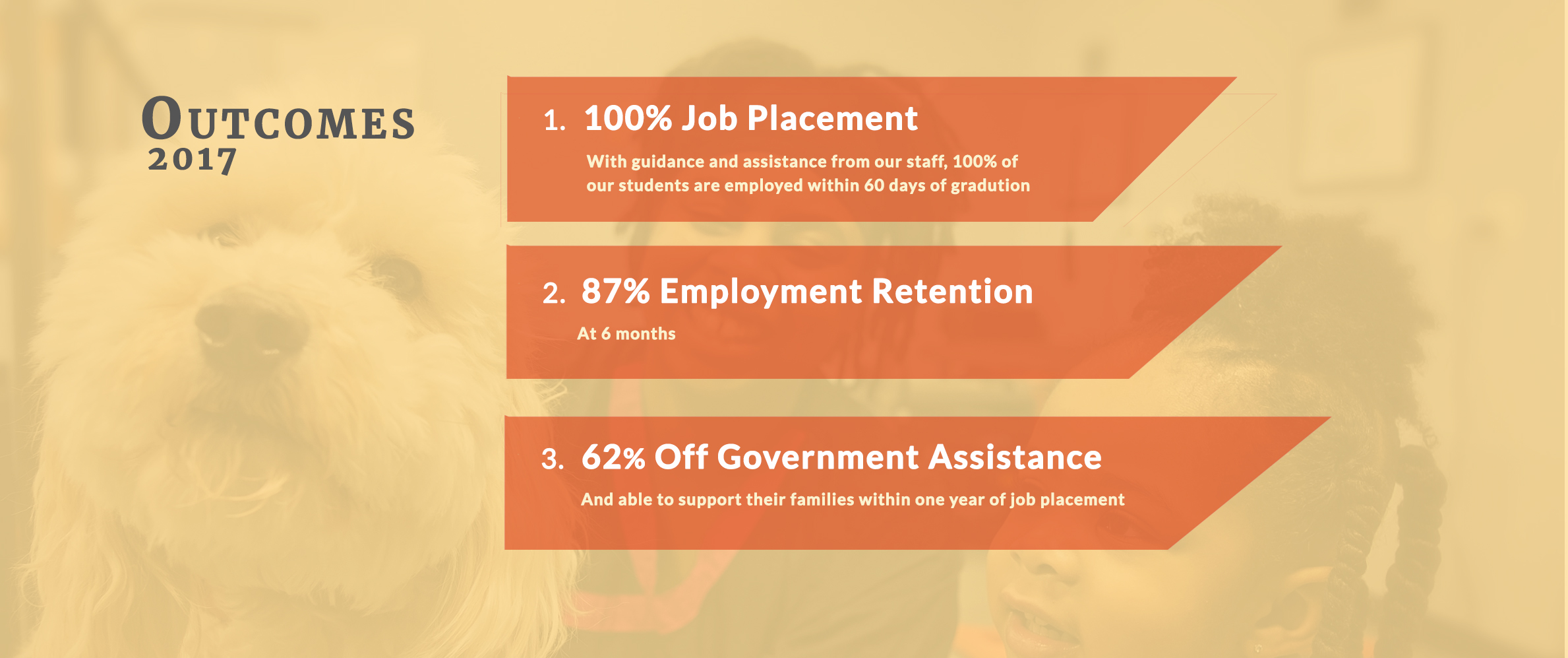
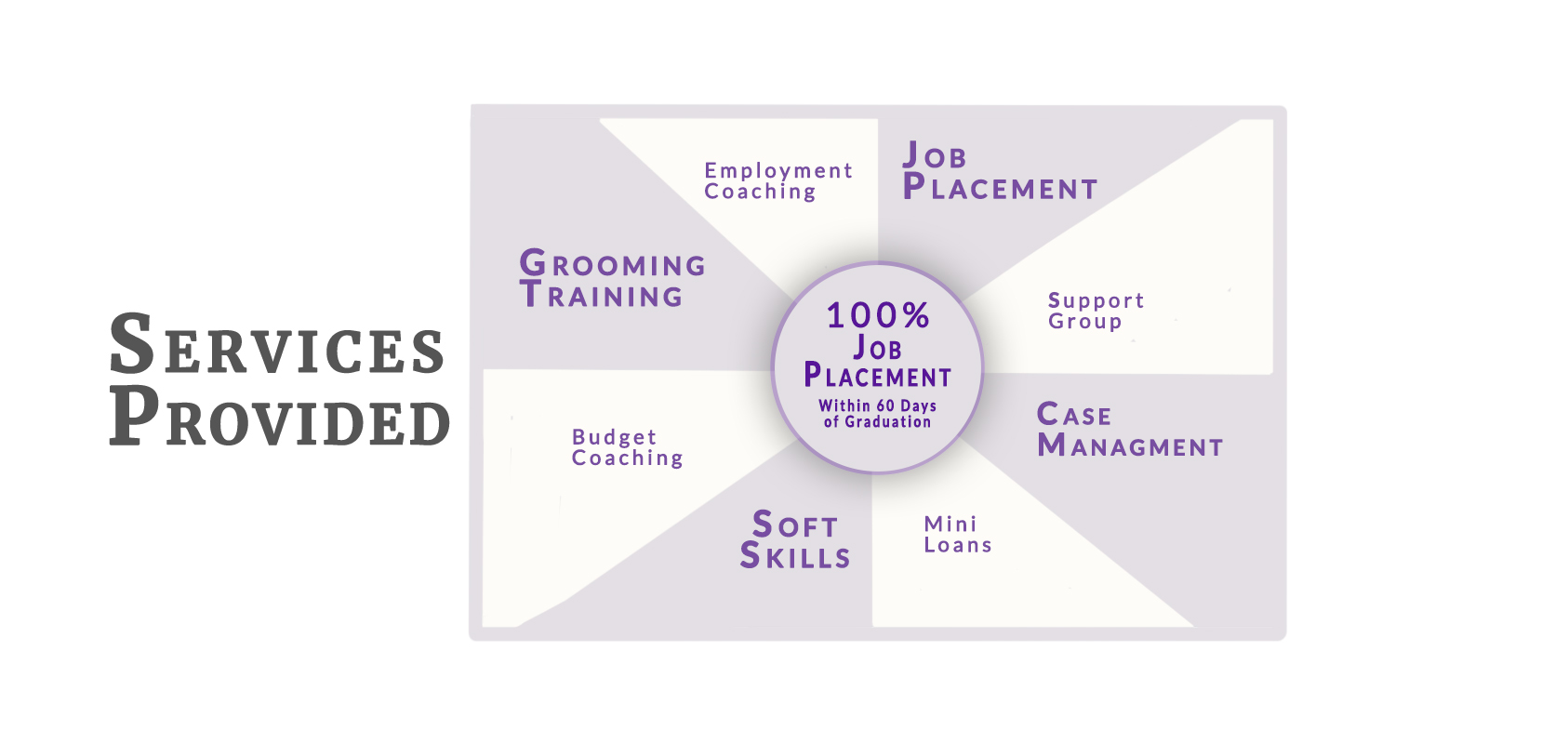
Information and financial data designs
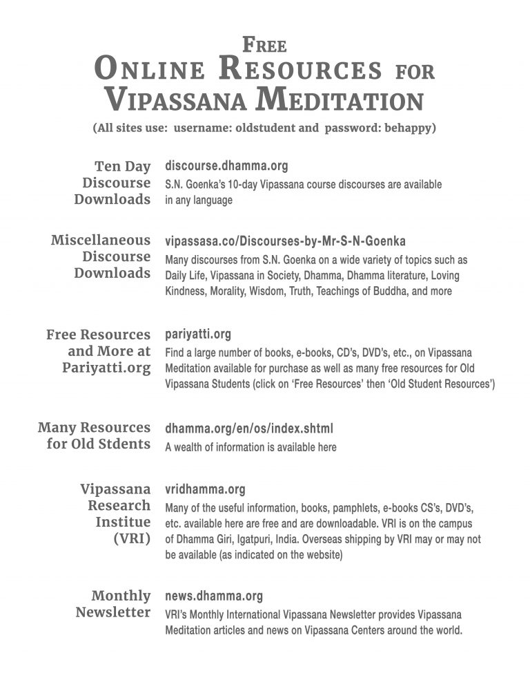
Information Design for Meditation Center (for Print)
